Tuesday 17 March 2015

Question 7 of evaluation


7. Looking back at your preliminary task, what do you feel you have learnt in the progression from?


Looking back at my preliminary task, I have learned a great deal of new things from planning to organisation to overall look. Mapping out everything using Photoshop is key to a uniform and organised structure. I have learned that it is easy to make a mistake but most if not all of them an be corrected. The positioning of a photo is crucial as putting it in the wrong place can easy obstruct everything else. Its the smallest things that can make a magazine stand out and through a lot of studying, I have learned that to make a successful house style, you have to take your audiences opinions into consideration.


The  placement of text is first of all essential, In the preliminary task, I got the placements all wrong at first, So I used Microsoft Paint software to forge the original task at hand, Before making it into a Photoshop piece.


When making my contents page, I learned the importance of photo placing, text and font.
It was during the production of the contents page that I learned about text size, font and spacing. As you can see, the looks of this are actually quite basic. Whilst the construction of this is quite simple, I spent the time getting familiar with the software because I had never used it before. With images, Its the quality hat counts, whether you take them or draw them, Its quality that gives the overall good looks.

Thursday 5 March 2015

Question 6 of Evaluation.

Question 5 of evaluation


5. How did you attract/address your audience?

To attract my audience, I had to take in a few different factors such as, the magazine’s look, direct mode of address, and a little something for everyone to attract many different people of different age groups. In doing my research and survey, I had to Identify and extract the information requested of me for a preferred magazine theme and look. Some audiences look for a dark theme and some are attracted to colours, so I had to come out with a way to perfectly express both without going overboard. Looking into the conventions of a rock magazine was easy given there were so many of them. After looking into all the conventions and types of rock there are, I have managed to mimic the conventions adding to my own house style. There are some stereotypes of rock I the conventions of my magazine, some dominant and some challenging. My biggest challenge was making the drawings to look like they belonged to the rock genre, But this type of art appeals to those who both love rock, anime and comics all mixed into one, with the serious attributes of what makes rock the way it is. It wasnt just looking into the dominant and challenging representations of rock music and following up on it, It was through research and development that I found a whole tree filled with the many branches of rock from sort core to heavy metal, there is a great many of the rock genre to take into account. In developing my music magazine, I managed to find a compromise to this and settle where it is just right, Not too soft for the hardcore rockers, But not too hard for those with a slightly classical approach such as the band 'Red' compared to 'Bullet for my Valentine'


Evaluation Question 4

Evaluation Question 4 from Media @ St. Bons on Vimeo.

Question 3 of evaluation


        QUESTION THREE


      What kind of media institution (publisher) might distribute your media product and why?


My magazine being a rock magazine might fall into the hands of either, publishers that like a challenge and take on something completely new, Or publishers that prefer to stay with what they already know. For example, Q magazine publishers known as Bauer already deals with the rock genre and would therefore either take on my magazine because it is within the same league, or dismiss it because of the why it presents itself. However, there are other publishers who take on a range of magazines for a good cause and thus would like to expand into something completely different. Something different in the eyes of some publishers are a good way to get their name out there as it demonstrated the need to be original and different. Expanding into different markets may not be easy, But having advanced into different fields are not necessarily a bad thing.

So who is Bauer?Bauer Media is a division of the Bauer Media Group, Europe’s largest privately owned publishing Group. The Group is a worldwide media empire offering over 300 magazines in 15 countries, as well as online, TV and radio stations.Bauer Media joined the Bauer Media Group in January 2008 following acquisition of Emap plc’s consumer and specialist magazines, radio, TV, online and digital businesses. Collectively, the Group employs some 6,400 people.Bauer Media is a multi-platform UK-based media Group consisting of many companies collected around two main divisions – Magazines and Radio - widely recognized and rewarded as being industry innovators.Their business is built on influential media brands with millions of personal relationships with engaged readers and listeners. Our strategy is to connect audiences with excellent content through our broad multi-touch point brand platforms, wherever and whenever and however they want. Their wide portfolio of influential brands gives us advantages over pure play magazine or radio competitors.Bauer magazine heritage stretches back to 1953 with the launch of Angling Times and the acquisition in 1956 of Motor Cycle News, both still iconic brands within their portfolio.


Evaluation Questions 2

      QUESTION TWO
  
                  How does your media product represent                                        particular social groups?

    Well, Music magazines are created and released for the soul purpose of fans keeping up with the work of their favorite singers, rap artists, rockers, the works. Media lie this belongs more to the social class of classes C1-E in the socio-economic class. Psycho-graphic class categories of people who may look into this form of social media would be from the aspires all the way down to the individualists. Everyone has their own motives as to why they love different types of music, and the social media they choose to follow. For example, Main-streamers, prefer to be like other people, So may choose their favorite band or singer to follow and aspire to. Demographics of media are always taken into consideration when looking into what the social media promotes, For example, Boy bands are linked more with gender.


    I have chosen to represent my media social group of the general audience f those who love rock, By using some of the most well known predominant and hegemonic stereotypes of the rock genre.
      I have done this by using a common pose among the genre lovers through the wide open mouth, tongue on show and hand gestures along with the painted nails and the ringed finger-less clove on each hand. However, I have chosen to find a means of challenging the stereotype a little by using skin color and ethnic race as an Ice breaker. How? I have chosen to instead place on the front cover; The dominant representation of a tattoo covered Caucasian person; I have chosen to place a mixed ethnic raced character to further dominate the representation of Caucasian people liking rock as I myself am of a mixed ethnicity. I have also decided to challenge this stereotype through the clothes and colors my character is wearing. Yes the gloves are a dominant representation, However you don't see the everyday hardcore rocker wearing a yellow scarf and green woolly winter hat. So I have successfully managed to throw in both dominant and challenging representations to follow my house style, and open up the style of rock a little further than people typically imagine.
       

I have also decided to expand on the hegemonic representations of the rock genre by adding in common features such as:

  •  Wild hair styles
  • Bright eyes 
  • Muscular body
  • Torn clothing
  • Tattoos
  • Rock themed clothing
  • Long jackets
  • Open jumpers
  • Mohawks
  • The use of the colors Red, Grey and Black.
  

Evaluation Question One.

Tuesday 3 March 2015

Tuesday 10 February 2015

Creation of the double page spread

Once the second stage was complete, I decided to write the double page conventions on Power Point in order to avoid too many grammatical errors and spelling mistakes. Once I was done, I copied and pasted the paragraph over to Photoshop and used my house style to change the text.

It was after setting this out did I realise there was an error in terms of how I decided to set it out, and as a result, I had to reset it all out. Starting from scratch was easy, And im now proud of my overall design.


So, Looking at both of my double page spreads, I came to like the way I spread the whole thing out the second time.


So my first one up against my second one, In terms of spacing and presentation, Over all, My original layout isn't very good. I'm happy with my final.


Creating the contents page

Creating the contents page pretty much flows the same format as the front cover, So I will present images to show you the initial changes made.

I first had to draw and colour the image, but I drew this approximately two years ago so its just an old image now. Turning it into an A page for Photoshop was simple and necessary for me to start my over all designs.

The next piece of the project was simple enough, I simply had to add text. For this I used the Photoshop text box with the font 'Sean of the dead' size 36.

Next I had to add the black bar across the page. This was done using the rectangle tool and making a thin and long rectangle stretched across the page so that the name of the magazine and issue number as well as page number can complete the design.

Here's where it all gets messy, It was during the procedure of this that I learned placement of font is the key feature of producing a masterpiece.

The black box is simply to make the text stand out so that it can be read, I am yet to learn how to manipulate shapes and texts to make a successful piece.

In making this contents page and looking at its over all construction, i had hellp in recreating my magazine to look more appealing. So, Here are the steps to recreating my contents page.

The first thing I did was shift the main image to the left so that laying out the rest of the page would be easier and more attractive.


As you can see, this is what happens just from shifting the image to the left, It opens up allot more space for you to ad the necessary components for this page.

from here on, I begin to add the cover page stars and the features and regulars of this mag.

 Now the page is beginning to look less of a mess, and more professional. Guidelines can take you a long way.

Next was adding coloured text boxes. It focuses your eye on all of what is going on and that is how you know you are doing the right thing.
I then begin to add all the other features such as the contents of the magazine as a whole before assigning the bands and pages they can be visited on.

Which brings us to what our page currently looks like as of this moment in time.

What i am looking to do is add a background box to the text so that it is easier readable. I will then add images from my photo shoot so that this magazine isn't purely cartoon manga.

Creation of the front cover

These images all show the production of my front cover of my initial music mag.


I opened up the image on an A4 page on Photoshop software. This is of a drawing I have done using an image I have used from my photo shoot.


I then added text to make the magazine title. This text was made using a Photoshop text box and used a font known as Lycanthorpe. The smaller text and bigger texts are actually separate creations that I later on merged together.


Adding text to make the sell lines was the easy part, Later on, I came to add images and features of the initial mag.

As demonstrated in the following images of the front page construction...


some of the band names on the front cover are made to sound like actual existing bands, But the truth is that only a few of them are existing bands in the world today, With some of the others being names I have heard from other people. However, This does not change the conventions of the magazine.

Later on, these features where changed. How? The background had to be shot. I decided to go with a dark forest background to further emphasize the mood of the theme. The fonts on the writing have been changed and the layout ha been completely re arranged.

Music Magazine- Creation planning.


 The following images demonstrate the creation of my front cover of my music magazine.

First of all, I took an image of my sister as i got her to pose in an appropriate stereotypical rock pose.

I then took the picture and manipulated it, Re creating it in the same sort of theme as the Gorillaz and thus creating my own style from it.

I then decided to create several other images and used this one for my front cover as a unique house style.


 These two images were created on the same basis as the first, however I decided originally that these were going to be my contents page and cover page, I decided not to once I drew up some images in my own style.


From drawing my own Images of what are the band members of the band I made up referred to as 'A Valentines Grace' I conjured up ideas of which ones to use and came up with both a contents page image and a double page spread.


 My contents page will then be designed so that the fonts are visible. My double page spread will be designed so that the text will mold around the image.


Tuesday 20 January 2015

Fonts for Mag

These are pending fonts I am thinking of using for my Music Magazine. They could be used for the front cover, cover page or contents page. Either way, Its a style that stands out
.

Draft of cover page PPT


These are draft images on a style/ set out for my music mag cover page. It follows the theme of rock but also has its own unique house style.

Photoshoot

I chose these photo’s because of the connotations they hold relating to rock whether they be dominant of challenging representations.


Poses: The poses chosen are specific towards the topic of rock, whether it’d be classic or new age, There is always a way to show its representation. For example, In the photo with Tom Cruise and Russell Brand, They show a dominant representative connotation of rock through the hand gesture. Its common upon the rock genre.

As a response to this, I have asked my models to use the same hand gestures in the hopes it would show the audience the representation intended.

Gorillaz research for my music mag


Gorillaz are an English virtual band created in 1998 by Damon Albarn and Jamie Hewlett. This band is fronted by four animated members: 2D (lead vocals, keyboard, and melodica), Murdoc Niccals (bass guitar and drum machine), Noodle (guitar, keyboard, and backing vocals) and Russel Hobbs (drums and percussion). These members are completely fictional and are not personas of any "real life" musicians involved in the project. Their fictional universe is explored through the band's website and music videos, as well as a number of other media, such as short cartoons. The music is a collaboration between various musicians, with Albarn being the only permanent musical contributor. Their style is an amalgamation of genres, with influences including rock, alternative, Britpop, trip hop, hip hop, electronica, indie, dub, reggae and pop.
The band's 2001 debut album Gorillaz sold over seven million copies and earned them an entry in the Guinness Book of World Records as the Most Successful Virtual Band. It was nominated for the Mercury Prize in 2001, but the nomination was later withdrawn at the band's request. Their second studio album, Demon Days, released in 2005, went five times platinum in the UK, double platinum in the United States, earned five Grammy Award nominations for 2006 and won one of them in the Best Pop Collaboration with Vocals category. The band has won numerous other awards, including two MTV Video Music Awards, an NME Award, three MTV Europe Music Awards, and have been nominated for nine Brit Awards. The combined sales of the Gorillaz and Demon Days albums had exceeded 15 million by 2007. The band's third studio album, Plastic Beach, was released in March 2010. Their latest album, The Fall, was released in December 2010 as a free download for fan club members, then in April 2011 as a physical release.


So how does this reate to my subject matter of Rock magazine? I wish to use the idea of animation in my magazine to create a unique house style. The way I will do it will be to gather photos I have taken, And re-draw them in an animated style to make my mag interestin g, different and appealing to the eye. My aim is not only to attract the rockers, But to attract those out there who love anime too! Making a manga edition would be interesting and fun for me, But will also relate to my exemplar band choice of the gorillaz which use animation to put fourth their music.

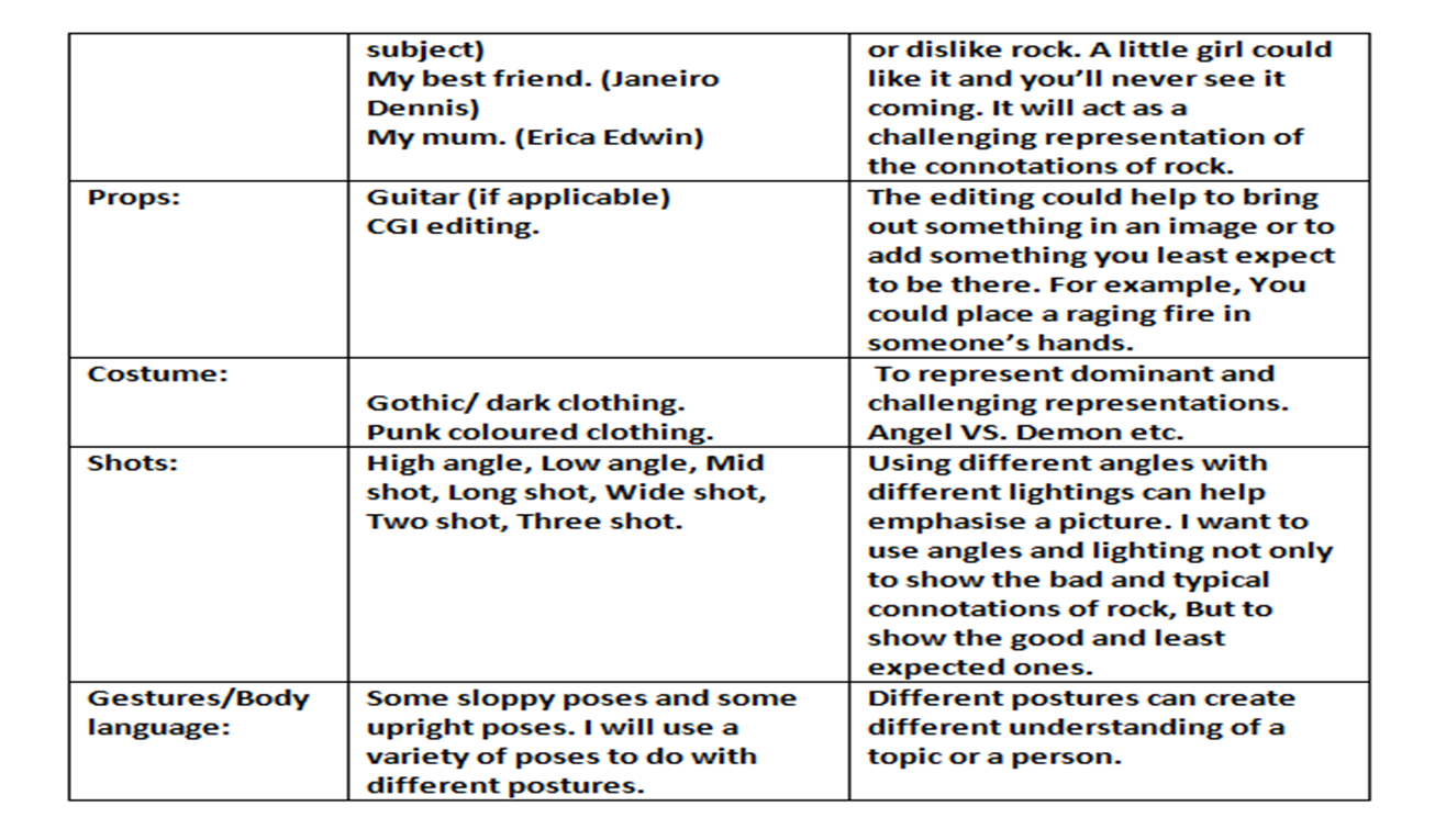
Plans for photo-shoot


These are my plans for my photoshoot that I will be taking for my music magazine/